Be yourself; Everyone else is already taken.
— Oscar Wilde.
This is the first post on my new blog. I’m just getting this new blog going, so stay tuned for more. Subscribe below to get notified when I post new updates.
Be yourself; Everyone else is already taken.
— Oscar Wilde.
This is the first post on my new blog. I’m just getting this new blog going, so stay tuned for more. Subscribe below to get notified when I post new updates.


Disclaimer: this is for a college project under Fair Use and not for commercial use. All rights to the original creator.

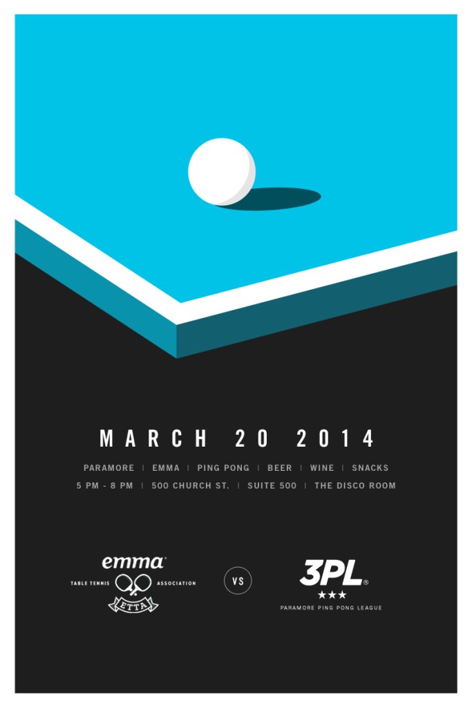
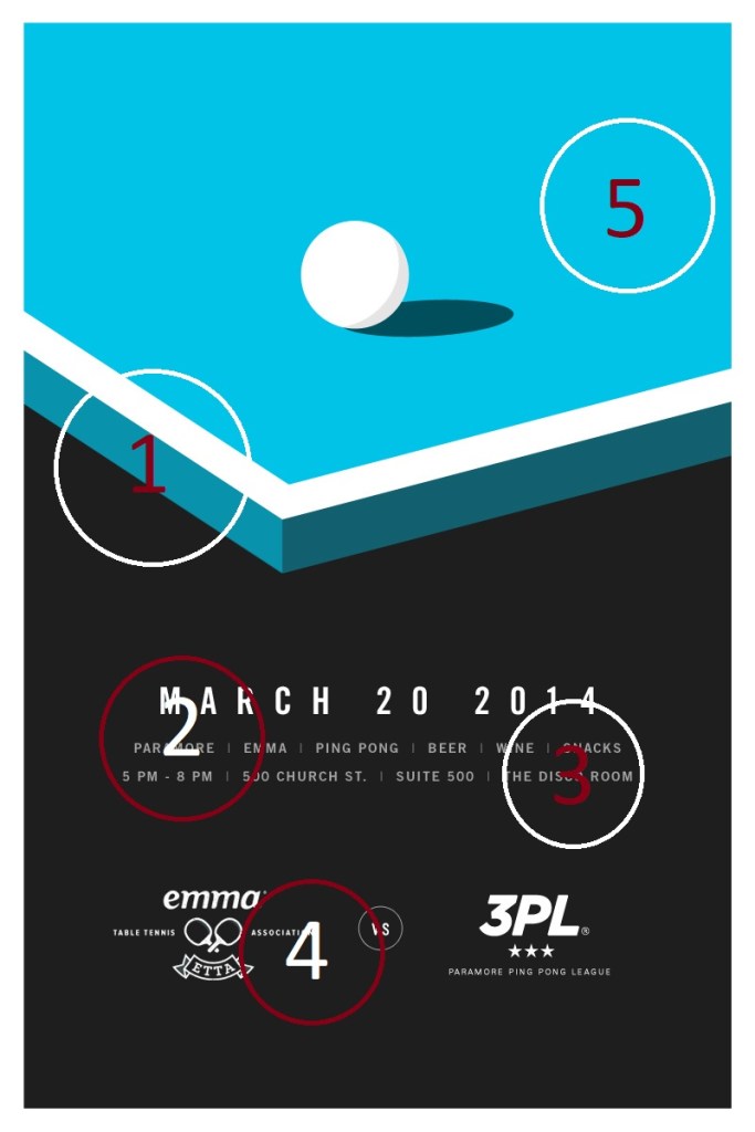
CONTRAST (#1) – The contrast between the bright blue color against the black background helps to separate the information from the art on the page. The design of the table also draws your eye downward towards the information. The dark background allows the limited text to stand out.
PROXIMITY (#2) – Important information is blocked together. The information that you want the audience to see immediately is contained right below the eye-draw blue. The date is within close proximity to the time and address. While the two teams noted below are important for the audience they are separated since they aren’t necessarily important for the goal of the poster.
REPETITION (#3) – Repetition is subtly used within the poster. The list of activities and the address use the same repetitive font. To keep the simplicity of the poster the designer uses only two fonts. Instead of using a third font to separate the address, the repetition keeps the poster clean. The only issue with this repetition is that the address (which may be more important for the audience) may blend with the less important items and get lost.
ALIGNMENT (#4) – While center alignment is typically frowned upon in design classes because it is the basic mistake beginners make, the proper use can create a clean design. Because the blue table draws your eyes downwards towards the center, it makes sense to center align the font. It also works with the limited amount of text needed on the poster.
COLOR (#5) – Much like the contrast, the color in the poster is important, both as a separator and eye draw. If you take out the blue shades, the entire poster is black and white. The pop of color organizes the poster and brings things together.
The principles of design are well used to create a coherent and simple poster. The color and contrast drive the movement of this poster. The proximity and repetition assist the audience in gathering the necessary information. The consistency of alignment throughout helps the reader follow the natural flow of the poster.
This is an example post, originally published as part of Blogging University. Enroll in one of our ten programs, and start your blog right.
You’re going to publish a post today. Don’t worry about how your blog looks. Don’t worry if you haven’t given it a name yet, or you’re feeling overwhelmed. Just click the “New Post” button, and tell us why you’re here.
Why do this?
The post can be short or long, a personal intro to your life or a bloggy mission statement, a manifesto for the future or a simple outline of your the types of things you hope to publish.
To help you get started, here are a few questions:
You’re not locked into any of this; one of the wonderful things about blogs is how they constantly evolve as we learn, grow, and interact with one another — but it’s good to know where and why you started, and articulating your goals may just give you a few other post ideas.
Can’t think how to get started? Just write the first thing that pops into your head. Anne Lamott, author of a book on writing we love, says that you need to give yourself permission to write a “crappy first draft”. Anne makes a great point — just start writing, and worry about editing it later.
When you’re ready to publish, give your post three to five tags that describe your blog’s focus — writing, photography, fiction, parenting, food, cars, movies, sports, whatever. These tags will help others who care about your topics find you in the Reader. Make sure one of the tags is “zerotohero,” so other new bloggers can find you, too.